
Introduction: More Than Just a Stitch on Stretch Fabric
The Lululemon logo isn’t merely a design; it’s a lightning rod. This abstract, fluid mark – officially a stylized ‘A’ – has sparked endless speculation, fervent brand loyalty, and heated controversy. From persistent myths linking it to the Greek Omega symbol, to provocative interpretations seeing a woman’s seated form, to its undeniable status as a badge of the global athleisure movement, the logo’s meaning is fiercely debated. Its power stems not from a single, inherent truth bestowed by its creators, but from its potent ambiguity – a blank canvas onto which millions project their aspirations, critiques, and understanding of modern luxury and self-care. Exploring its interpretations is a journey into branding alchemy and cultural projection.
Genesis in Granville – Chip Wilson’s Vision and the Birth of an Icon (Approx. 2,500 words)
- The Pre-Lulu Landscape: Vancouver, late 1990s. Yoga is transitioning from fringe practice to burgeoning mainstream trend, often practiced in baggy cotton or ill-fitting gym wear. Technical performance apparel exists, but it’s largely the domain of hardcore athletes, not mindful movement. Enter Chip Wilson, a serial entrepreneur recovering from back pain, finding solace in yoga. He sees a gap: clothing engineered for the unique demands of yoga – stretch, breathability, sweat-wicking, and style.
- The “Aha!” Moment & The Name’s Mystery: The infamous story: Wilson observes yoga participants contorted in downward dog, realizing their clothing was inadequate. The name “Lululemon” itself is a layer of the brand’s mystique. Wilson claimed he chose it because Japanese people found the ‘L’ sounds difficult to pronounce, making it sound exotic and premium in that market – a rationale later criticized as culturally insensitive or simply odd marketing. The name evokes playfulness (“lulu”), lemon (freshness, vibrancy?), but its true linguistic intent remains debated, adding to the brand’s enigmatic aura.
- The Logo’s Conception: Design by Committee or Singular Vision? Early branding involved collaboration. Wilson reportedly worked with designers (specific individuals are less documented in popular lore than his own pronouncements). The brief: create something clean, modern, distinctive, embodying the brand’s core values – technical innovation, community, mindfulness, and aspiration. It needed to work small (on a tiny hangtag) and large (on storefronts), on fabric and paper. The result was a radical departure from the swooshes and leaping figures of sportswear giants.
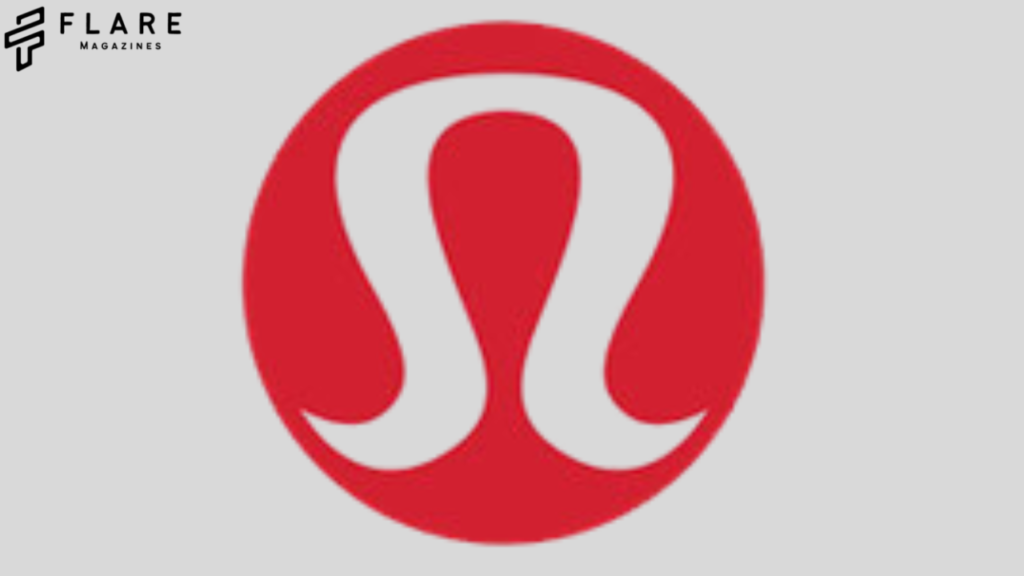
- The “Stylized ‘A'” Explanation – The Surface Layer: The most common, official-sounding explanation is that the logo represents a stylized letter ‘A’. Why ‘A’? Possibilities:
- Athletics: Signifying the brand’s performance roots.
- Aspiration: Reflecting the brand’s core value of pushing personal boundaries.
- Alignment: Resonating with yoga’s focus on physical and mental alignment.
- “Athletica”: A nod to the emerging category it helped define.
- (Or simply, a strong, simple geometric form starting with ‘A’). This explanation is functional but feels almost deliberately simplistic, a placeholder inviting deeper exploration.
Beyond the ‘A’ – Unpacking the Symbolic Universe (Approx. 4,000 words)
- The Omega (Ω) Connection: The Unfolding Flower of Potential:
- Visual Resonance: The logo bears an undeniable resemblance to the Greek letter Omega (Ω), the last letter signifying “the end.” However, in Eastern philosophies adopted by yoga, Omega can symbolize completion, perfection, the ultimate reality, or the universe itself. Crucially, it’s often seen as a vessel, an opening.
- Lululemon’s Interpretation (Implied): Wilson and early branding hinted at this. The logo was described as an “unfolded flower” or “a stylized representation of a person in a meditative pose” seen from above, suggesting an opening, blooming, or unfolding of human potential – core to the Lululemon ethos. It signifies the journey, the becoming, not just the destination. The angularity suggests structure and focus channeling this unfolding energy.
- The “Three Legs” Controversy: Wilson later offered another interpretation: the logo represented “the beauty of the female form,” specifically “three women’s legs coming together at the crotch.” This comment, made years after the logo’s creation, ignited significant controversy. Was this a genuine original intent (unlikely given its complexity at small scale), a clumsy metaphor for community, or an off-the-cuff remark revealing underlying attitudes? Regardless, it became a shadow narrative attached to the symbol, highlighting how interpretations can diverge wildly from design intent.
- The Japanese Aesthetic: Wabi-Sabi, Ma, and the Power of Negative Space:
- Cultural Influence: Wilson’s professed admiration for Japanese quality, minimalism, and design profoundly shaped Lululemon’s early identity (despite the ‘L’ naming controversy). The logo embodies key Japanese principles:
- Wabi-Sabi: Finding beauty in imperfection, impermanence, and simplicity. The logo is starkly simple, asymmetrical yet balanced. Its angularity could be seen as an embrace of the “imperfect” geometric form.
- Ma (間): The concept of negative space, pause, or interval. The logo’s central void is crucial. It’s not just the red shape; it’s the relationship between the red and the space it defines. This “ma” represents the breath in yoga, the pause between thoughts, the potential within stillness – core tenets of the practice Lululemon clothed.
- Red as a Symbol: In Japan, red (Aka) signifies energy, vitality, passion, and life force – perfectly aligned with athletic endeavor and the vibrancy Lululemon sought to project, contrasting with the muted palettes of traditional yoga wear.
- Abstract Geometry: Modernism, Precision, and the Rejection of the Literal:
- The Bauhaus Legacy: The logo eschews literal representation (a person doing yoga, a lotus flower) for pure abstraction, echoing modernist design principles championed by the Bauhaus: form follows function, reduction to essentials, geometric purity. This signaled Lululemon wasn’t just selling yoga pants; it was selling a modern, design-conscious lifestyle.
- Precision Engineering: The sharp angles and clean lines subtly reflect the brand’s foundational promise: technically superior, precisely engineered apparel. It looks constructed, not organic, mirroring the innovation in fabric (like Luon®) happening behind the scenes.
- The Power of Ambiguity: By not being a literal symbol, the logo becomes a Rorschach test. Individuals project their own meaning: a mountain peak, a wave, an abstract flame, a heart (albeit angular), a gateway. This ambiguity fosters a deeper, more personal connection. It doesn’t tell you what to feel; it invites you to feel something.
The Logo as Corporate Entity – Brand Identity & Strategic Evolution (Approx. 3,000 words)
- Building an Empire on an Angle: From Vancouver Studio to Global Powerhouse:
- Early Adoption & Tribal Identity: The logo became a badge of belonging for early adopters. Wearing it signified membership in an aspirational community focused on wellness, quality, and a certain aesthetic. The logo’s distinctiveness ensured instant recognition within this tribe.
- Scalability & Versatility: The logo’s geometric simplicity proved genius for scaling. It remained legible and impactful embroidered tiny on a waistband, screen-printed large on a bag, or illuminated on a massive store facade. Its monochromatic nature (primarily red/white or black/white) ensured adaptability across countless product colors and materials.
- The “Cult of Lululemon”: The logo became synonymous with the brand’s intense community focus – free in-store yoga, educator expertise, local ambassadors. It wasn’t just clothing; it was a lifestyle signaled by the emblem. The logo became a visual shorthand for exclusivity (premium price point) and aspiration.
- Subtle Shifts & Consistent Core: Navigating Growth and Controversy:
- Refinements, Not Overhauls: Unlike many brands undergoing radical logo changes, Lululemon’s evolution has been subtle. Minor refinements to line weight, proportions, and the exact angle of the “legs” have occurred, but the core form remains instantly recognizable. This demonstrates strategic confidence in the original symbol’s power.
- Controversy and Resilience: The logo weathered storms alongside the brand: the 2013 sheer-pants recall, Chip Wilson’s controversial comments (including the “three legs” interpretation and remarks about body types), accusations of exclusivity and lack of size inclusivity. Through these, the logo remained a constant visual anchor. Its abstract nature arguably helped it remain somewhat detached from specific controversies, acting as a resilient brand totem.
- Expansion Beyond Yoga: As Lululemon expanded into running, training, tennis, and everyday wear (“On the Move”), the logo seamlessly transitioned. Its abstract athleticism and modern feel allowed it to represent performance across disciplines, not just on the yoga mat. The meaning of “A” could effortlessly stretch to encompass “Athletics” more broadly.
Consumer Psyche – What We Project Onto the Red Angle (Approx. 3,000 words)
- The Aspirational Canvas: Status, Belonging, and the “Ideal Self”:
- The Premium Signal: The logo signifies a significant financial investment. Wearing it broadcasts disposable income and a prioritization of quality and self-care. It’s a marker of achieving a certain socioeconomic status or aspiration towards it.
- Tribal Membership: It signifies belonging to a global community perceived as health-conscious, active, stylish, and goal-oriented. It’s a non-verbal statement: “I am part of this group.” The logo fosters a sense of shared identity among wearers.
- The Embodied “Ideal”: Lululemon marketing heavily features exceptionally fit, often lean bodies performing flawlessly. The logo, attached to garments designed to flatter and perform, becomes associated with achieving that “ideal” physique and lifestyle. It represents the pursuit of personal best, the visualized goal.
- Wellness, Mindfulness, and the Performance Paradox:
- The Yoga Connection: For many, the logo remains inextricably linked to yoga – evoking calm, mindfulness, flexibility, strength, and inner peace. It symbolizes the time dedicated to self-care on the mat.
- Beyond the Studio: The “Performance Lifestyle”: The logo also represents the broader “performance lifestyle” – the ability to transition seamlessly from workout to coffee meeting to errands, looking put-together and feeling capable. It signifies efficiency, modernity, and a body ready for action.
- The Paradox: Does a logo signifying mindfulness become diluted when worn in the high-stress corporate world or during frantic errands? Does its association with extreme athletic performance clash with its yogic origins? The logo embodies this tension within modern wellness culture – the pursuit of calm amidst constant performance pressure.
- Personal Interpretations: The Rorschach Effect in Action: Interviews and anecdotal evidence reveal diverse personal meanings:
- A symbol of personal triumph over adversity (weight loss, injury recovery).
- A reminder of self-investment and worth.
- A simple appreciation for clean design and quality.
- For some, negative associations due to controversies or perceptions of exclusivity.
- The abstract form allows these deeply personal narratives to coexist with the brand’s intended messaging.
Deeper Cultural Currents – The Logo in the Zeitgeist (Approx. 2,500 words)
- The Rise of Athleisure: Lululemon, propelled by its strong identity symbolized by the logo, wasn’t just part of the athleisure trend; it was a primary driver. The logo normalized high-performance wear as everyday fashion, blurring the lines between gym and street. It represented a cultural shift towards comfort, functionality, and body consciousness in daily attire.
- Wellness as Status Symbol: The logo exemplifies how wellness became a key indicator of social capital in the 21st century. Displaying the Lululemon logo signals participation in the expensive ecosystem of fitness studios, clean eating, supplements, and self-optimization – the modern “wellness industrial complex.”
- Minimalism and the Rejection of Logomania (Ironically): In an era of loud branding and logo saturation, Lululemon’s minimalist emblem stood out precisely because it wasn’t shouting. It exuded confidence through understatement, aligning with a broader cultural appreciation for clean design and “quiet luxury” (even at a premium price). Ironically, its very recognizability made it a powerful logo, despite its subtlety.
- The Female Gaze and Empowerment (Amidst Controversy): Despite the “three legs” controversy, many women embraced the brand and its logo as representing strength, freedom of movement, and clothing designed for their bodies and activities by a company initially perceived as female-focused (though now more inclusive). The logo, for many, symbolizes empowerment through physical capability and confidence. However, the shadow of past remarks about body image and inclusivity continues to complicate this narrative for some.
The Logo Under the Microscope – Design Criticism and Controversy (Approx. 1,500 words)
- The “Three Legs” Legacy: Wilson’s interpretation remains a persistent stain. Critics argue it reveals a reductive or objectifying view of women underlying the brand’s origins, regardless of design intent. It serves as a case study in how offhand founder comments can permanently alter the perception of a visual symbol.
- Inclusivity and Exclusivity: Does the logo, associated with premium pricing and historically limited size ranges, symbolize aspiration or exclusion? Critics argue its ubiquity in affluent, often homogenous communities reinforces social divides. Efforts towards greater size inclusivity and diversity in marketing are slowly shifting this perception, but the logo still carries baggage for some.
- Authenticity vs. Commercialization: As Lululemon scaled into a multi-billion dollar corporation, did the logo’s meaning shift from authentic yoga community to mass-market commercialism? Can a symbol retain its connection to mindfulness while adorning products sold in vast quantities globally? This is a tension inherent in any successful brand symbol.
- Design Critique: Is it Too Simple? Some design purists might argue its simplicity borders on generic or lacks the warmth associated with wellness. However, its enduring recognizability and adaptability stand as a counterargument to this critique.
Part VII: The Future of the Angle – Evolution in a Changing World (Approx. 1,500 words)
- Enduring Power vs. Eventual Evolution: The logo’s resilience suggests it has remarkable staying power. Its abstract nature gives it flexibility. However, no logo is eternal. How might subtle refinements continue? Could a major overhaul ever be justified (e.g., to distance from past controversies or signal a radical new direction)?
- Sustainability and the Logo: As Lululemon invests heavily in sustainability (LikeNew resale, materials innovation), how might the logo’s meaning incorporate environmental consciousness? Could it evolve to represent circularity or responsible innovation without changing its form?
- Technology Integration: Could the logo become interactive? A scannable code embedded in embroidery? A visual trigger for AR experiences linking to product info or mindfulness content? The minimalist form provides a perfect canvas for digital augmentation.
- Global Interpretations in Evolving Markets: As Lululemon expands aggressively into Asia, Europe, and beyond, how do cultural interpretations of the abstract symbol differ? Does the Omega connection resonate more strongly in certain regions? Does the “A” hold the same connotations?
Conclusion: The Unfolding Legacy – A Symbol That Means What We Need It To Mean
The Lululemon logo is not one thing. It is a palimpsest upon which meanings are layered: founder vision, design principles, cultural appropriation (intentional or not), corporate strategy, consumer aspiration, personal narrative, and cultural zeitgeist. It is simultaneously:
- A stylized ‘A’ for Athletics, Aspiration, Alignment.
- An unfolded Omega, blooming with human potential.
- An embodiment of Wabi-Sabi and Ma, finding power in simplicity and space.
- A talisman of the athleisure revolution.
- A badge of belonging to a global wellness tribe.
- A lightning rod for controversy and critique.
- A masterclass in minimalist branding and adaptability.
- An abstract vessel for our individual hopes for strength, peace, and purpose.
Its power lies precisely in its refusal to be pinned down. It is a silent partner to the sweat, the stretch, the stillness, and the striving. It means quality engineering. It means community investment. It means premium price. It means “see me, I prioritize this.” It means different things at 6 AM on a yoga mat than it does at 6 PM in a grocery aisle. It carries the shadow of its founder’s words while simultaneously representing the empowerment of millions of wearers.
The true, unique meaning of the Lululemon logo is this potent, evolving ambiguity. It is a mirror reflecting the multifaceted, sometimes contradictory, nature of modern wellness culture itself – the pursuit of inner peace amidst external performance, the commodification of mindfulness, the democratization of aspiration, and the enduring human desire to belong, to improve, and to express identity through the symbols we wear on our skin. It is not just a logo on leggings; it is a cultural Rorschach test, etched in red thread, continuously unfolding its meaning one wearer, one interpretation, at a time. Its final meaning may forever remain, like the practice it often clothes, a journey without a definitive end.